


Modern Application for
The Mello
As part of a passion project, I set out to create a modern application experience for a snack company I created - Mello. I had 10 days to create a color scheme, logo, prototypes and working wireframe.

A PROBLEM TO SOLVE
The Mello app, which sells food products, is facing a challenge in effectively attracting and retaining online ordering without using services that are hurting their overall profit margins.
Other issues include limited visibility and awareness among potential users, difficulty in differentiating from competitors, and potential issues with user experience and satisfaction.
The app needs to address these concerns to enhance its market presence, increase customer engagement, and ultimately drive sales and revenue.
BRAND RESEARCH
“Research is creating new knowledge.” - Neil Armstrong
I wanted to make the app familiar to users so that it was easy to navigate and complete the user journey. In oder to remove the middleman in the ordering process, I needed to recreate what users expected would expect from the middleman.
I set out to find the best user flows and site layouts for this purpose. These were the four companies that I decided to use as a muse:

These apps had the best user scores, meaning that not only did they look great, they also gave the customers what they wanted:

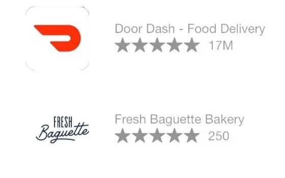
Quickly I saw that these companies used the best flow in terms of convenience and simplicity, which are key in any design that is looking to keep a customer engaged.
After determining what the app should look and feel like, I started the ideation phase, to determine how I wanted my app to interact with what The Mello wanted.
CUSTOMER RESEARCH
To get a feel for what my customers wanted, I set up a questionnaire for my participants to answer.
The questions used were:
1. What specific features or functionalities would you like to see in a food app?
2. What type of cuisine or dietary preferences would you like the app to cater to?
3. How important to you is fast delivery?
4. How important is it for the app to provide nutritional information for the recipes or meals?
5. Would you like the app to have a social aspect, such as the ability to share recipes or connect with other food enthusiasts?
6. How important is it for the app to have a seamless ordering and delivery system for food delivery services?
7. Would you like the app to offer meal planning or grocery list features?
8. How important is it for the app to have a user-friendly interface and intuitive navigation?
9. Is there any other specific functionality or feature you would like to see in a food app?
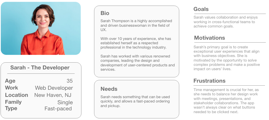
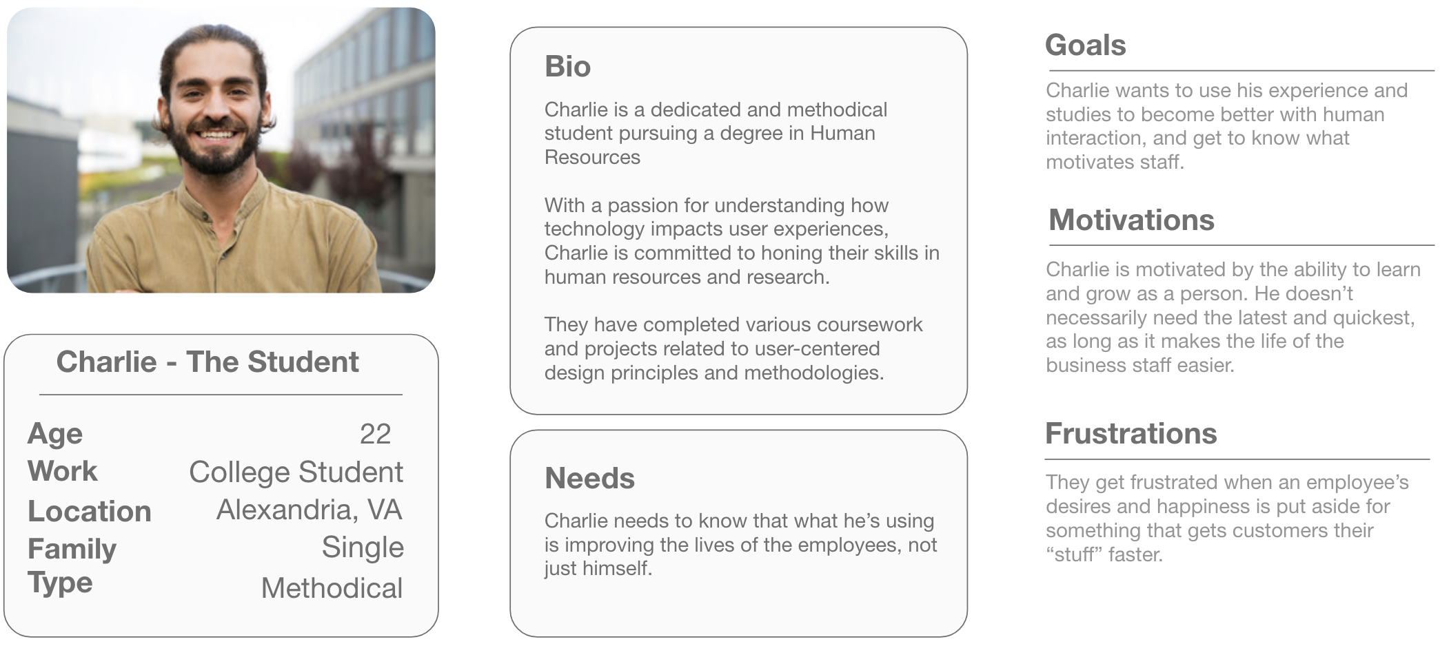
After gathering the data from my 10 participants, I created user personas that summarized the main feedback and what they were looking for in their app design.
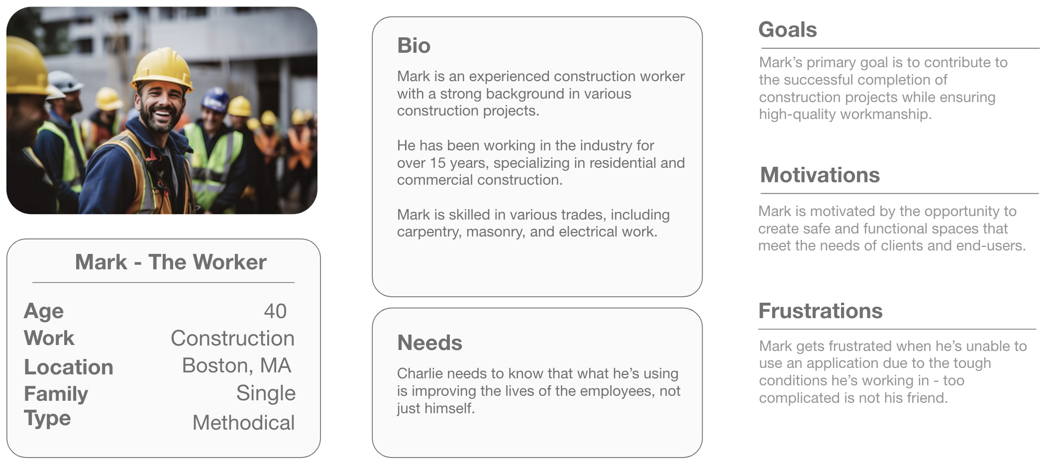
PERSONAS
IDEATION
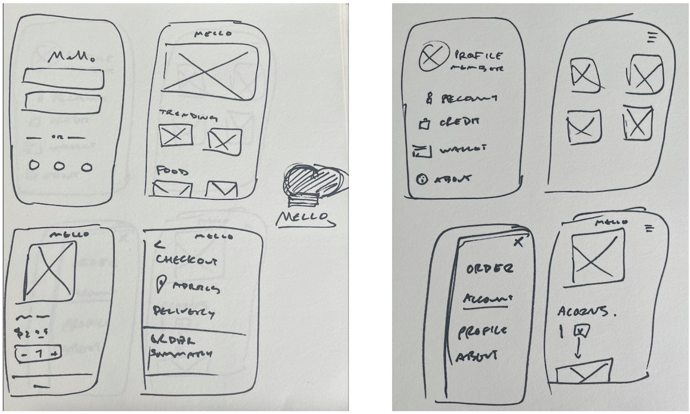
I started ideating the same way that I always do - simple sketches that can produce creativity. I believe that the more ideas that are sketched out, the better (and ultimately faster) the end result will be.
These are some of my original sketches for The Mello app:
LOW-FIDELITY WIREFRAME
After getting my sketches more finalized, I began on a low-fidelity wireframe using Adobe XD.
I discovered that the more sketches I had to reference, the faster the low-fidelity wireframe took shape. In all, it took two days to complete the low-fidelity wireframe seen below:

After feeling good with the wireframe, I went back to my survey group, and asked them follow up questions to the original set of questions:
1. How would you rate the overall user experience of the app?
2. What specific features or functionalities did you find most useful or enjoyable?
3. Were there any aspects of the app that you found confusing or difficult to navigate?
4. Did you encounter any technical issues or bugs while using the app?
5. How would you describe the app's performance in terms of speed and responsiveness?
6. Did the app meet your expectations in terms of meeting your needs or solving your problem?
7. Were there any features or functionalities that you felt were missing or could be improved?
8. How would you rate the visual design and aesthetics of the app?
9. Did you find the app's interface intuitive and easy to use?
10. Would you recommend this app to others? Why or why not?
With the feedback given, I was able to change some aspects of the wireframe, and make the hi-fi wireframe. One of the main feedbacks was that the checkout page of the app wasn’t as clear as it should be, and users were unclear if they had actually finalized the shipping process.
Also, I added an “address” selector, based on feedback that it would be nice to have addresses saved due to repeat ordering.
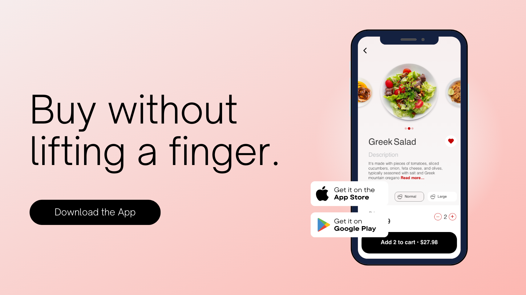
HIGH-FIDELITY WIREFRAME
The final stage of the wire framing step included putting together all of my data and ideas, and creating the final wireframe.
Key features that were included in the wireframe:
Large, clear images of food to make the user understand what they’re ordering
Consistent imagery throughout the app, using The Mello’s bright red color scheme.
An easy checkout system to make sure users can quickly get their order on the way.

NEXT STEPS
The next steps for The Mello app would be to work with the developers to ensure that overall look and feel and can be as close to the wireframe as possible.
There will also be another round of user surveys, to make sure that all their needs and comments are met. It’s important to do this step before development, because it’s much cheaper to edit a wireframe than recode an app’s site map.
IN CONCLUSION
The Mello was a fun app to create and showcase how a business can remove the middleman and in return have higher customer satisfaction and profit margins.
If I had more time to expand on the designs, I would create a user profile page, and create a more “social” feel to the app, including reviews and comments from the user base.
